Redesign of the Visual Identity Origin Energy
The Origin changed the way we consume energy. With the rental of our solar farms, you don't have to spend anything to reduce your electricity bill.
THE CHALLENGE
Origin Energia Eficiente had been on the market for a few years and its visual identity was in need of updating. With an already solid brand in the market, its investors did not have the correct impression of the size of the company's importance. They needed to build a solid identity that communicated assertively with their most diverse audiences. Based on this, we faced the challenges of:
- Analyze the current visual language Know the market Understand the universe of the segment Identify opportunities Define the main attributes of the brand and the path to be taken
Visit the ORIGIN website
THE BEGINNING
Gruv's first task was to understand the brand's current language and, during this diagnosis, point out exactly what needed to be changed. There were already created brand expressions, customer relationships, and everything would need to be done carefully so that the stakeholders were only positively impacted by the change.

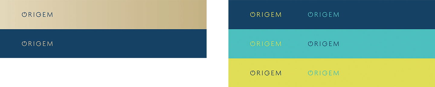
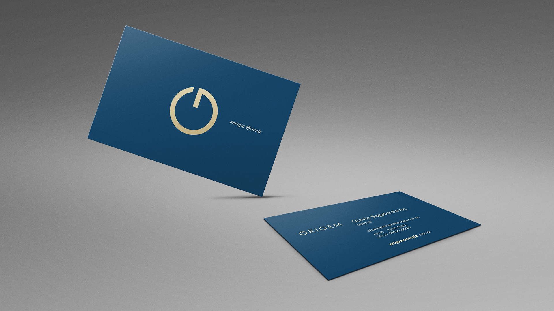
From there, we needed to review the logo's proportions to improve the signature's legibility, especially when reduced, standardize the use of brand colors and make the logo design more proprietary.
The path was to propose a richer visual language, with which it will be possible to explore more ingredients and create visual expressions that are more consistent with each other. We started by defining more brand-related attributes that could generate insights for the visual identity.
- Natural Renewable Technology
Transformation | Cycle
Solar | Clean
Resources | Knowledge

After creating the main logo, we then needed to create separate subscriptions, one that would communicate well with the brand's investor audience and one that would then talk to the retail market, in this context premium subscriptions arise.
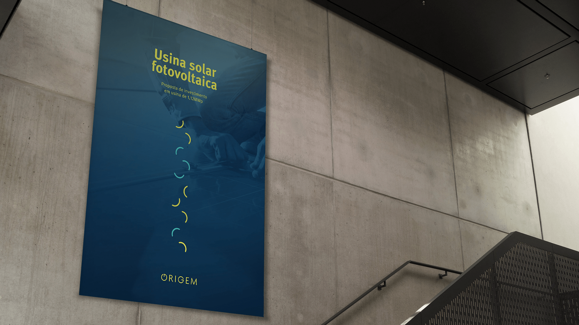
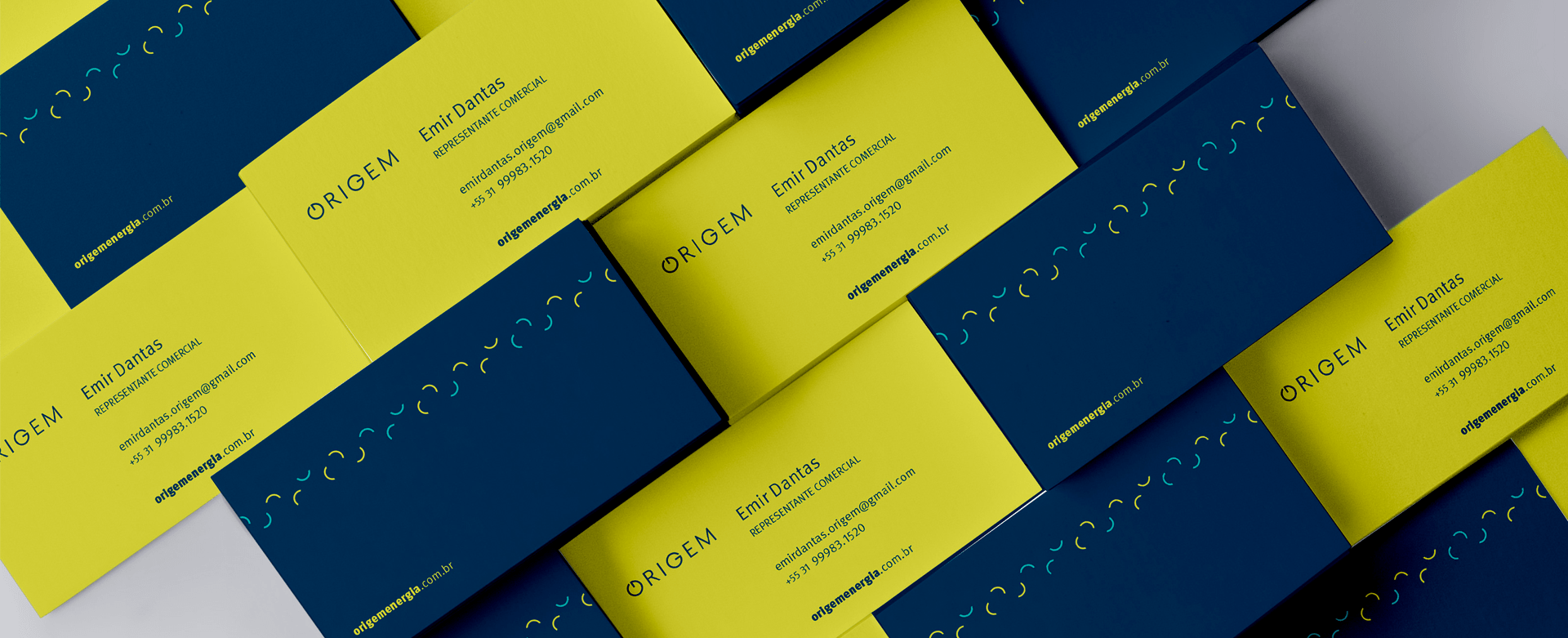
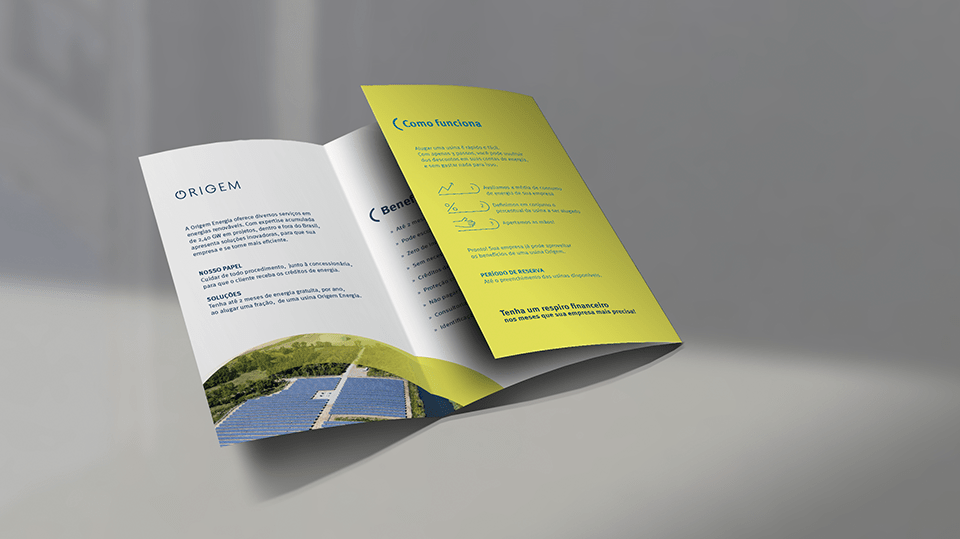
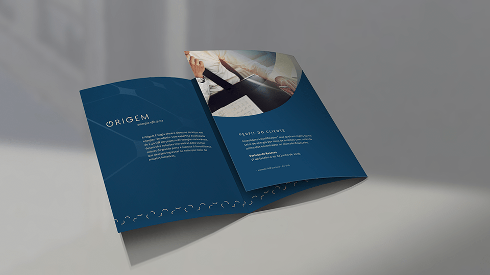
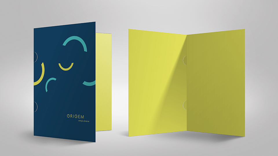
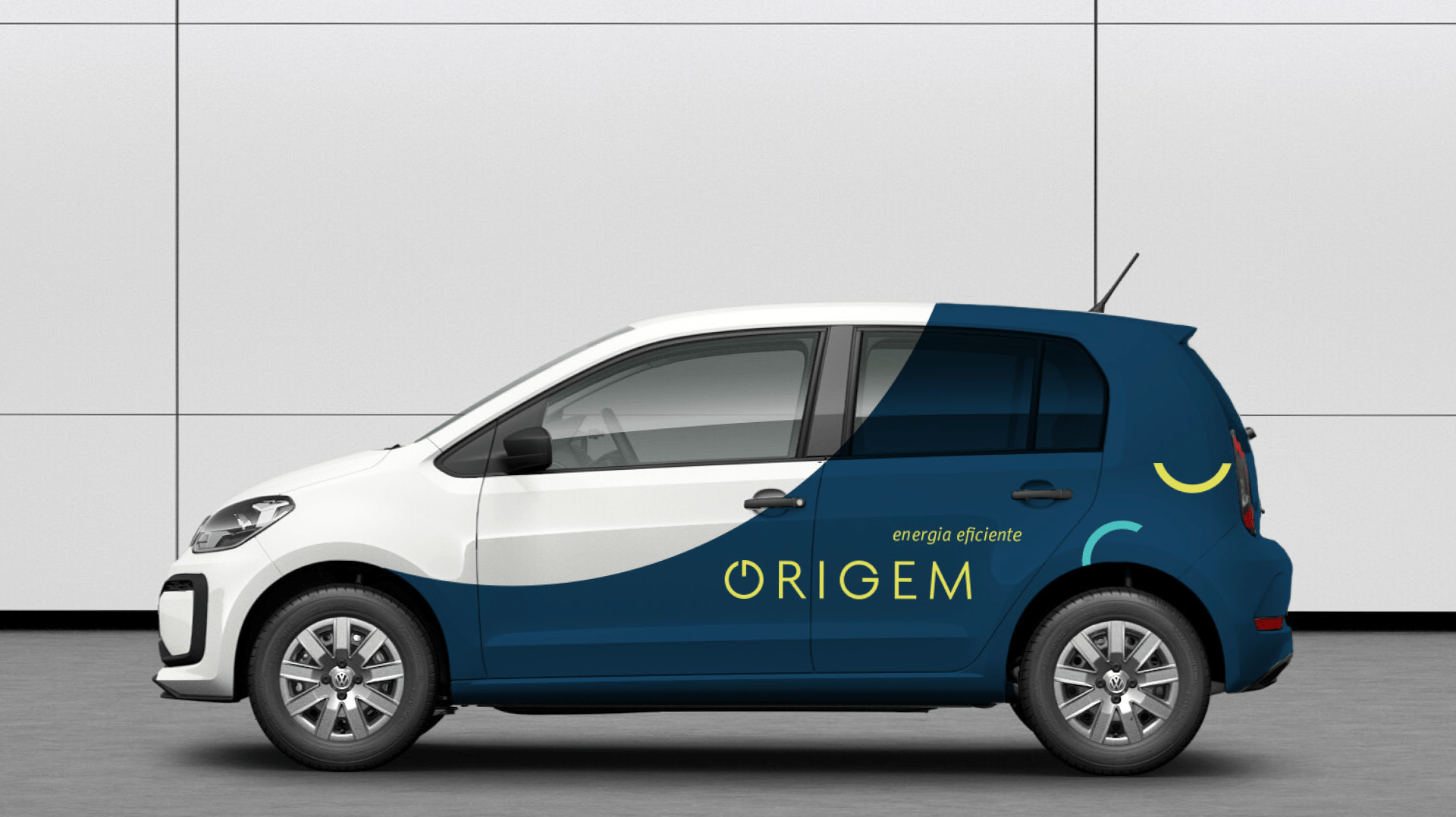
During the work of creating visual expressions, we also created graphics, iconography and patterns so that together they could carry all the attributes of the brand and thus create a stronger and more proprietary visual identity.
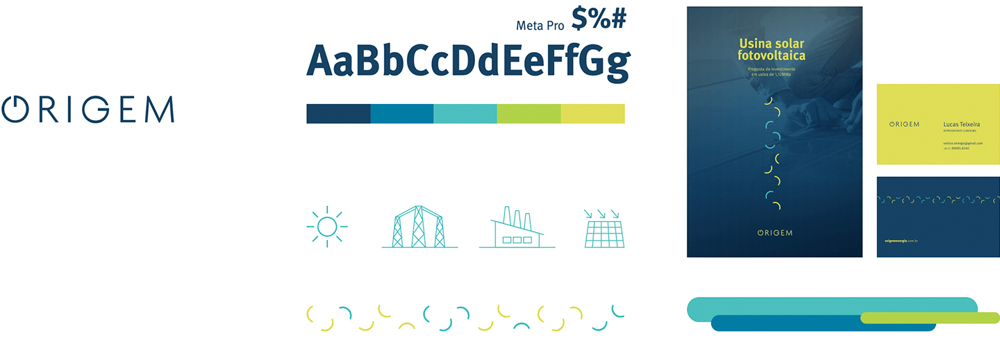
From this constructed language of graphics, we then began to create the visual expressions of the brand.


To share
Related projects