CHARD By Chicago Prime
Chard carries the house's quality tradition of premium meats, with the nuance of bold proposals for a more modern cuisine.
The challenge
Help build the brand of a new restaurant in one of Brasilia's postcards: Pontão do Lago Sul. With a sophisticated proposal, we were challenged to develop and create the Visual Identity of this new venture and how to make it known and desired in the city
The Dynamic
We needed to create an identity that reflected the brand's sophistication and minimalist style. Therefore, we sought an authorial typography, which would be in harmony with the Chicago Prime logo, but without losing its originality.

An extended typography, which has its own intervention on the letter A and gave rise to the main texture of the brand.
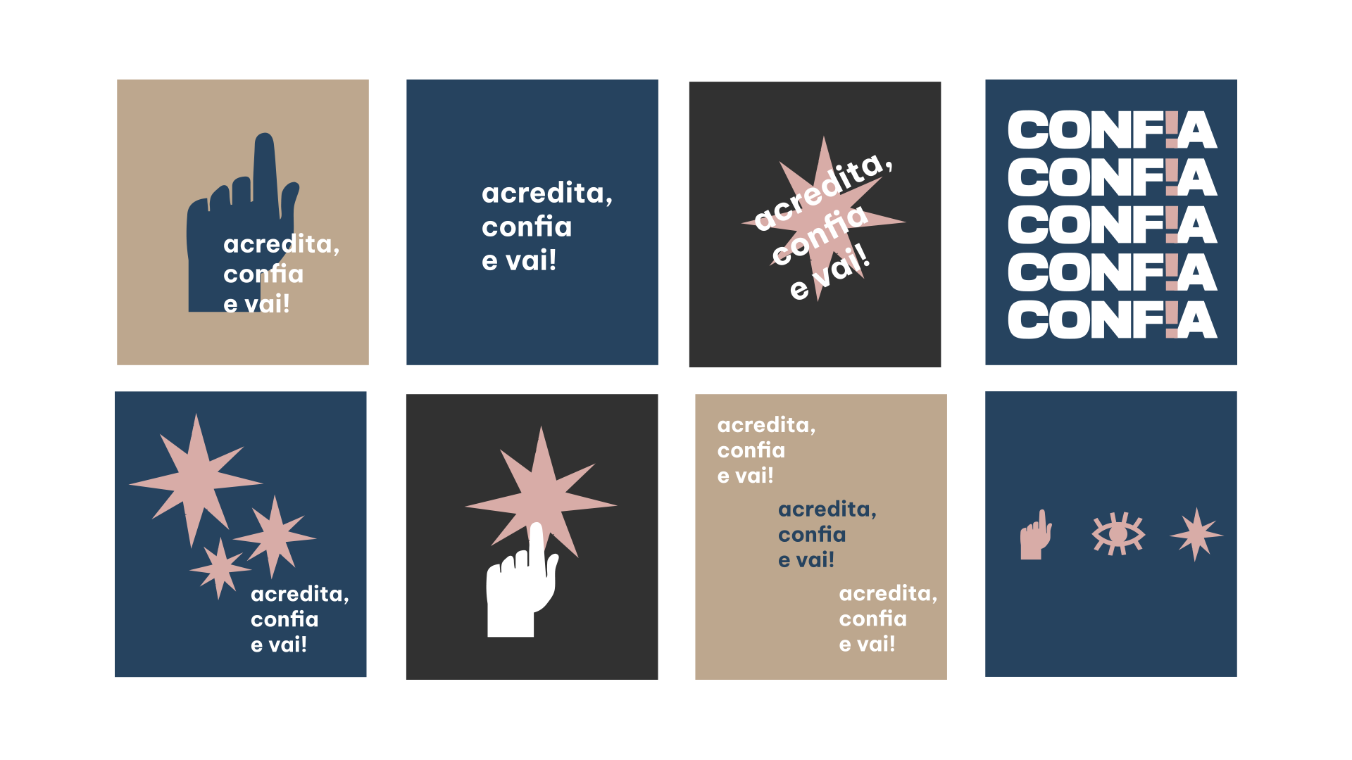
What before was just a dream, became reality because there were people who believed, trusted and didn't hesitate to make it happen. To promote the main concept, we released a teaser video to warm up the fans and introduce the contents:
With the help of the video producer CRIAmov, who did all the capturing of images, we propose a series of videos with the members of the group to tell more about their trajectories, which made them continue to trust until they reached where they are.
And confidence was not lacking for this band to become what it is today! That's why we took advantage of all the audience that accompanies and is part of this story, reinforcing communication on social networks, which intensified conversations about recording the DVD, generating anxiety and desire for the big day.
New Paragraph
Conclusion
When we go together, we go further. Weeks of preparation and a DVD recording that went down in the history of Menos É Mais and all the people who were present at the event. Very successful partners and a team focused on the same goal: launching an audiovisual product that was the result of a lot of dream, persistence and trust.
To share
Related projects