Visual Brand Identity
The main objective was to create a brand that conveyed
the ideas of modernity, solidity, confidence and agility.
THE CHALLENGE
In 2020, Intrabank brought us the challenge of developing its visual identity. The main objective was to create a brand that conveyed the ideas of modernity, solidity, confidence and agility. In addition, we needed a visual language that would stand out in the competitive market in which the company operates and that would impress a demanding and high-end public.
THE RESULT
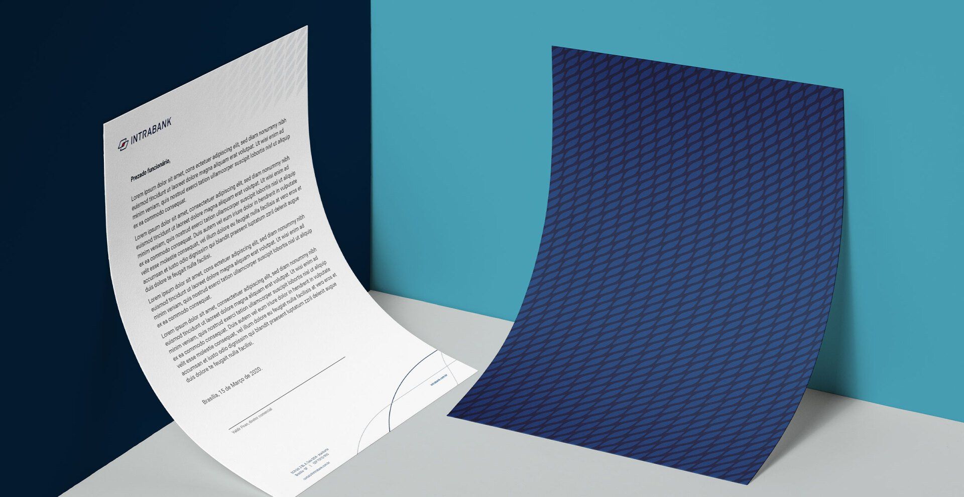
The result of this work was a striking, versatile visual identity, with good applicability and, above all, consistent with the idea behind the brand's concept.
The client
Intrabank, now with more than 30 years in the market, is a financial structure of investment funds destined to credit operations for companies and economic groups. In other words, the company works, today, as a fund that offers services that drive the growth of companies.
Among their services, they offer customized financial solutions from products structured by CCBs, CCIs, financing of productive chains and working capital operations, guaranteed by the flow of receivables, contracts, diversified credit rights and real guarantee.
the strategy
We worked together on applying the naming process and then started the brand's Visual Identity. We defined the pillars: seriousness, specialty and solidity. After all, they are characteristics of the mercantile development market.
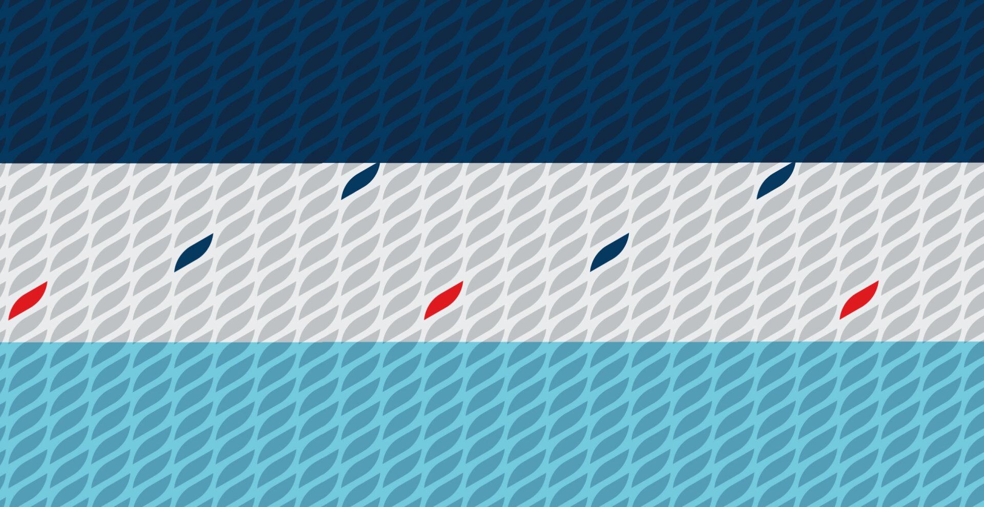
For the execution of this project, we decided to combine solidity and tradition with the modernity and proximity of the new fintechs, which have dictated a new financial market. We sought an identity that generated connection with people, but that was not too cool to the point of not being trusted. With this path in mind, we built the brand symbol, its texture and defined the color palette.
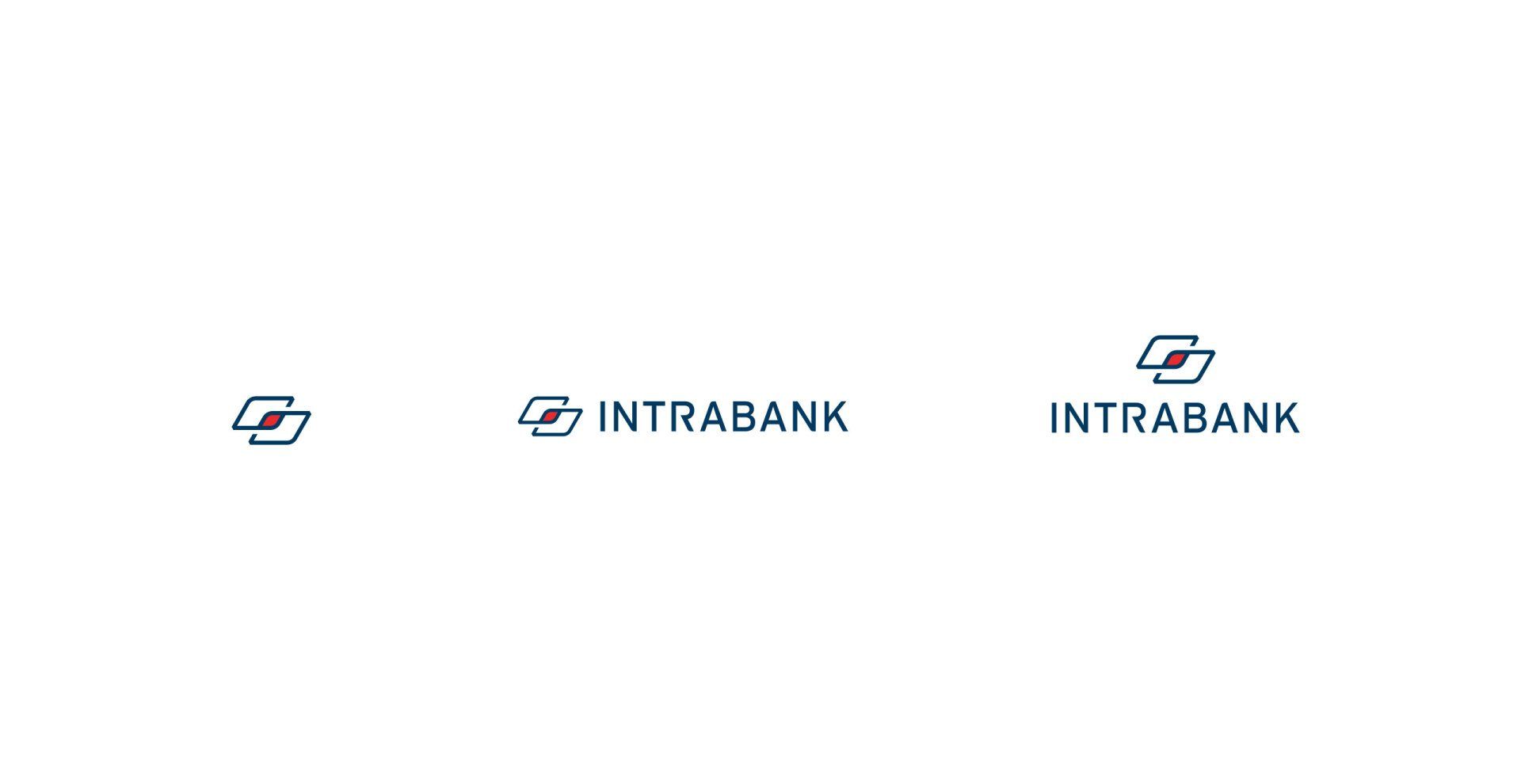
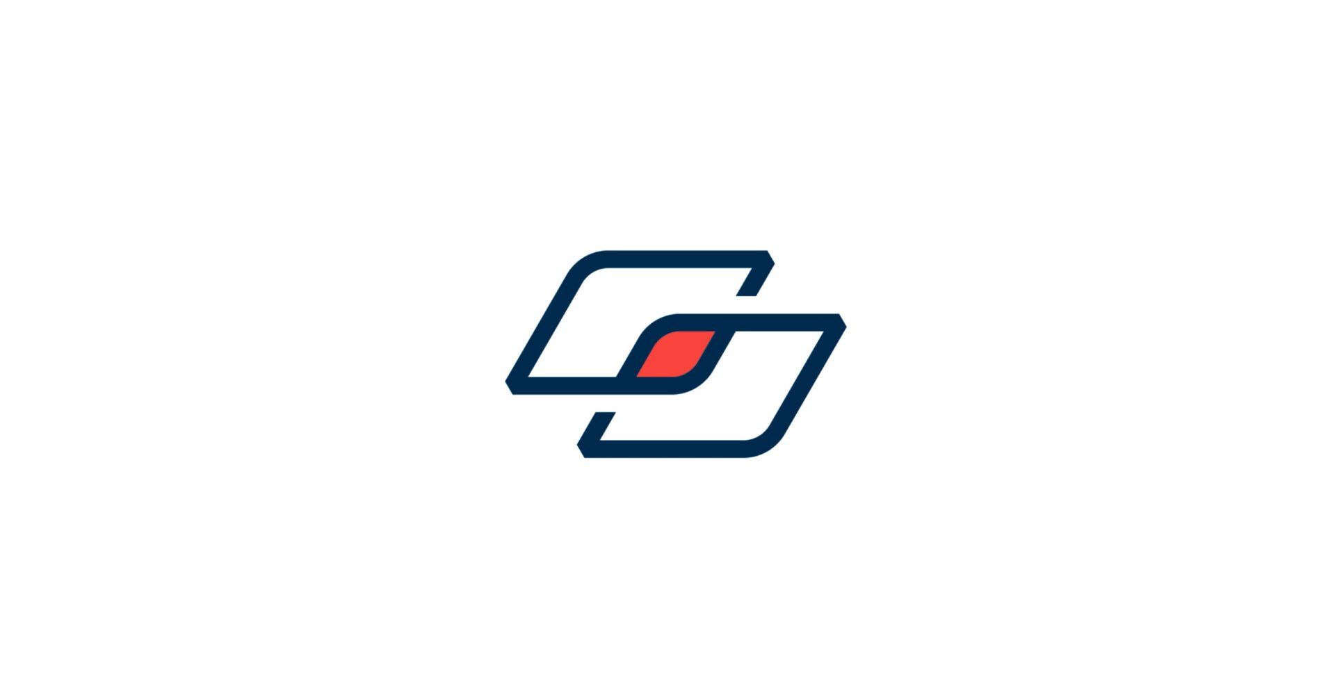
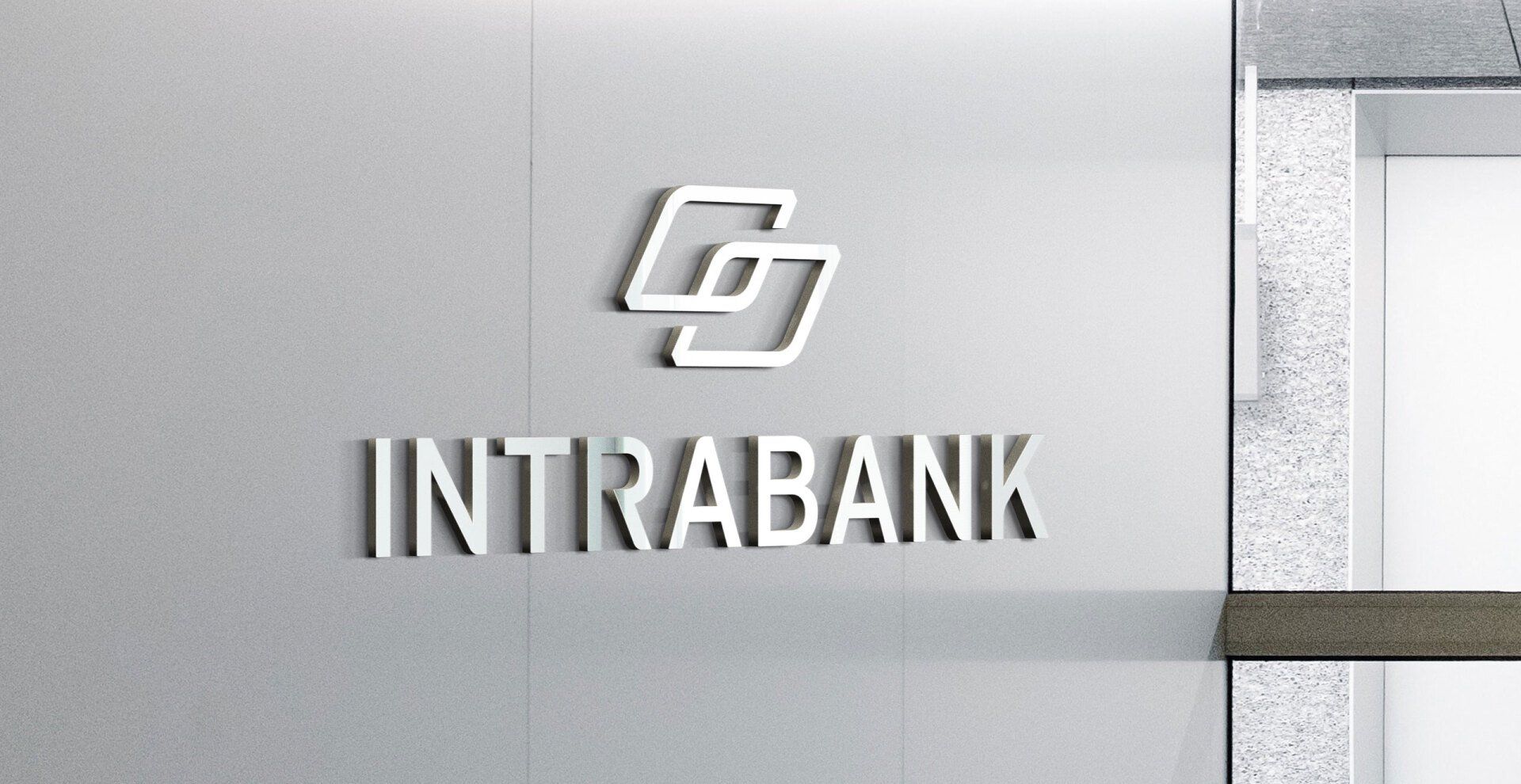
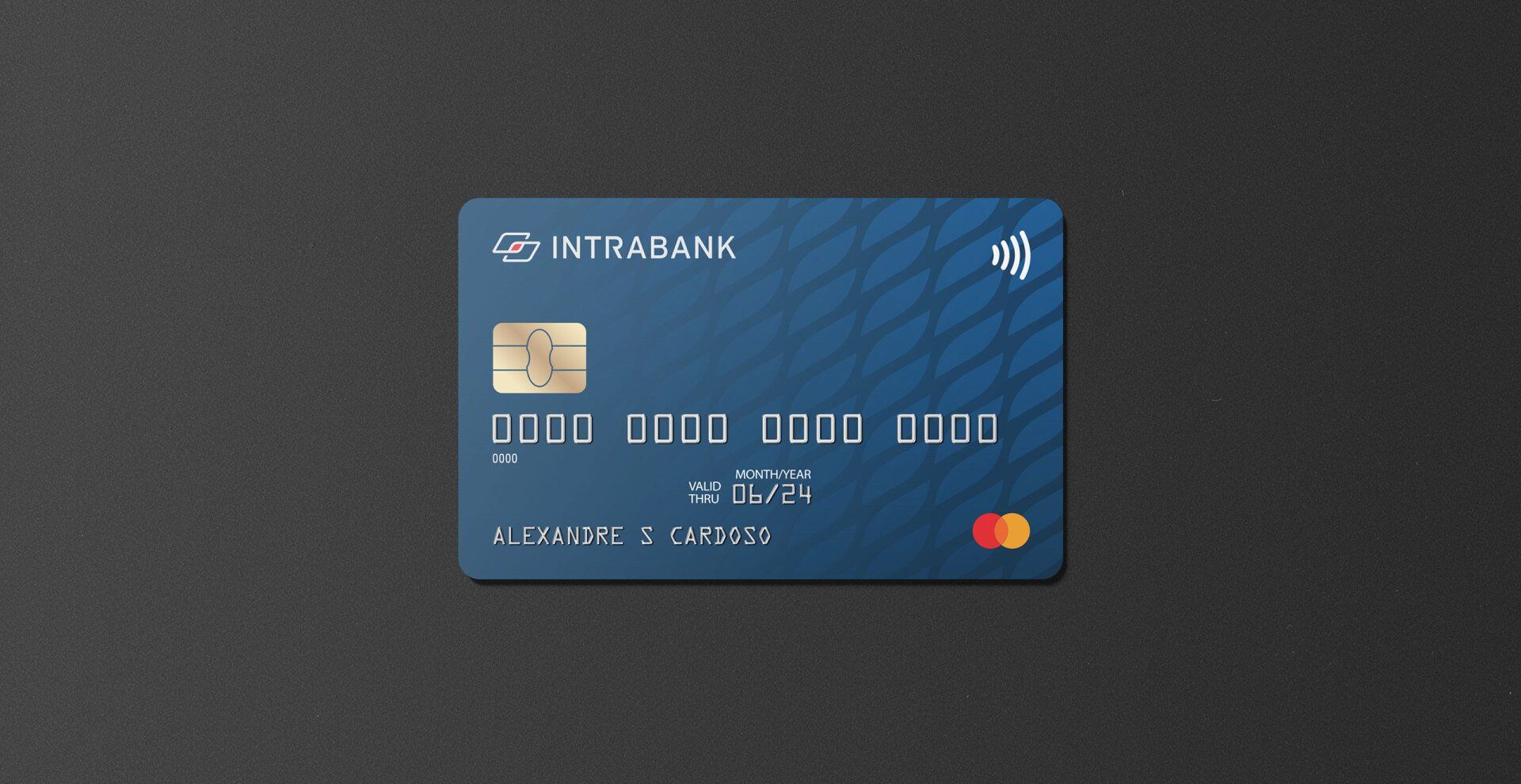
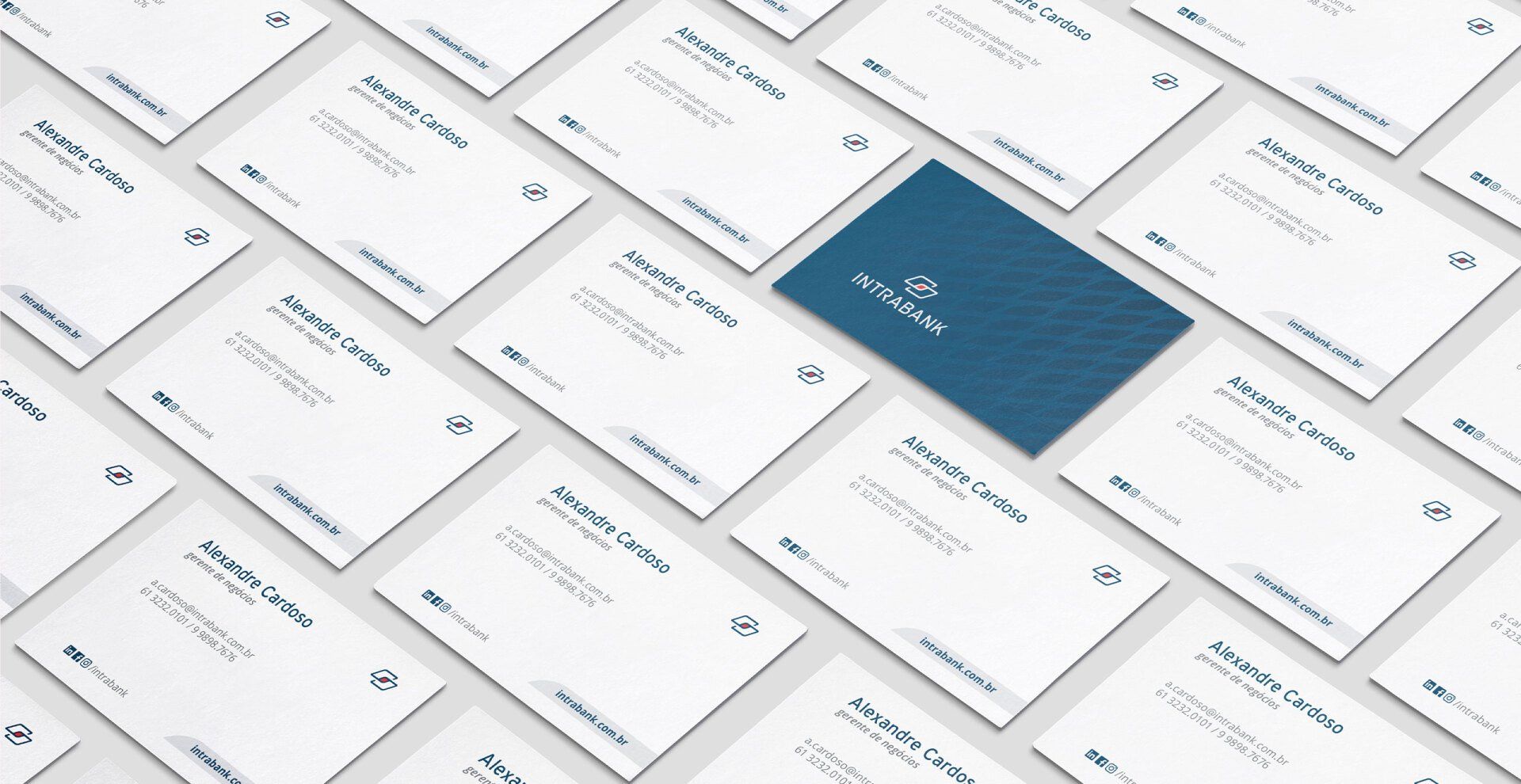
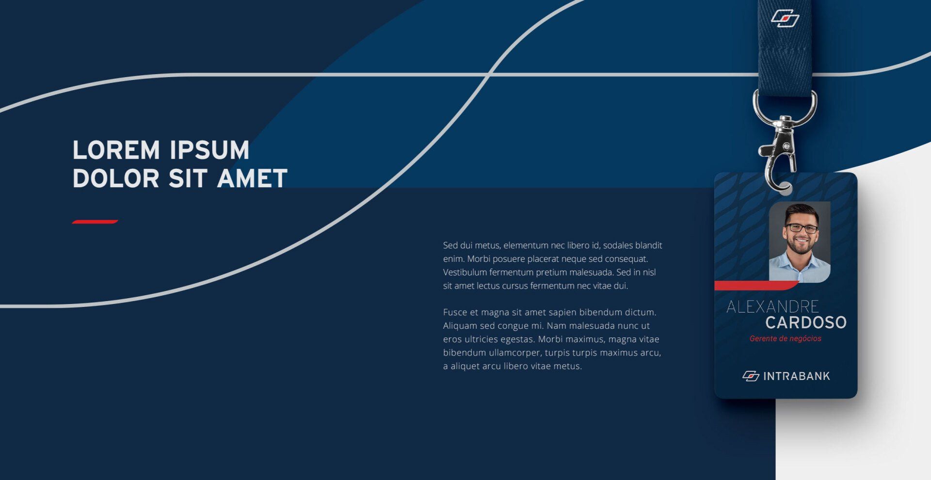
Link is the name of the icon we created. It is composed of two links, representing the bank and the investor, in the center, the two parts symbolize the protection of the assets of its investors. In this way, we managed to translate to the brand, in a light and modern way, the brand's relationship with its customers.
To share
Related projects